7.2.11

I created this lego brick to display the title pages, i think it works well here, but will see how consistent it is and how well it works.
front & back cover.
Going to go ahead with designing other pages & come back to this later on so i can think about it more after having time away from it.

6.2.11

added logo and title of 'Annual report'.
initial idea developed.
Colour added to make the visuals more interesting.
I dont know whether to keep the clothes all white or leave them.
was thinking maybe something interactive, like free colouring pencils so the reader can ceate their own outfits?
initial idea
Thought of using actual lego as a background?
too much again.

Lego-initial ideas.

The idea behind this was to create something that was less corprate. This take on it was very 'playful' with the colours. These colours represent the bricks of lego.
As a design, this does not work, the colours are too much.
Maybe try with less colour, or find a way to incorporate it in a less obvious way.

2.2.11

Annual report

Task 1: Design a company Annual Report & Accounts that escapes the stereotypical.
Annual Reports are published by companies who are required by law to submit an audited
set of profit and loss accounts, detailing income and expenditure for that year. A Report
usually includes statements from the chairman and directors that tell shareholders how the
company has performed over the last twelve months and what they expect to do, in terms of
business development and growth in the coming year.
Traditionally annual reports have been very staid and ‘corporate’ in their approach. Often
they are visually similar with little character or personality, heavily illustrated with images of
grinning employees and often reliant upon an (un)healthy use of stock ‘business images’.
Pages and pages of dull text and sometimes unintelligible graphs! This approach is changing
- the annual report not only has to present the legal information, but also has to reinforce a
company’s position globally, through its public face.
Choose a business or organisation that you already know about, or something that you have
a strong interest in; alternatively take a commodity such as wood, soap, metal, electricity, oil,
water, plastic, paper, paint, rubber, cloth…

23.1.11

http://vimeo.com/1874188

A video I am watching for critical studies to help with my presentation on my modernist designer.

16.1.11

Finalised.

ok, so these are my finalised designs.
Coming from the original idea, i think i've done whats been asked.
It's defiantly more personalised now. Everything bar the gill sans type is my own design and something I have hand made.
Now for the crit tomorrow to see how it goes.
Using a handmade typeface.

rough finals??


.....

10.1.11

handmade covers


I have six of these excercise books, I am going to cover them as i would have done when i was still a young teen.
I am going to try relate them to the title for each seperate book.
love
tears
pressure
late

I will then scan these in and try work with them.

More diary covers...


proof

Yes, photographic evidence they are my diarys.

wreck this journal


I am looking at this book because of the texture of the tape.
I have this book and if you run your fingers over the tape part, it feels smooth and shiney.
I love this effect on books, for some strange reason i just like touching it.
I also think from a design point of view it is a nice element as it makes the design more interesting.

Scanned in images of my diarys.


10th january crit

I didn't enjoy this crit.
I felt a bit unprepared for it, I only had one idea, and when it came to printing it, it came out wrong because the type i downloaded to use wouldn't come up on the uni computer, despite the fact it was embedded!

Luckily Jaz had his laptop so I could show my work at the crit.

Points I took from the crit.
too clean
not enough variation
Needs to be more girly
too sterile
personal
boys.

Think more about teenage girls, and what they would have on their diary.

I have many old diarys which i have stuck stickers on, drew on and so on.
I will scan these in and possibly able to work with these.
I think the advantage with that is that when i had these diarys, i was the same age as the characters in the book so I related to them at the time.
Now I am about 6 years older and don't think in the same way anymore.

I am going to re-create a handmade diary for this too.

initiial idea

Focusing on how the book is written / teenage girls.
This is the front of a diary i created.


8.1.11

Girls out late

'Girls out late' collection - early teen romance.
Feel more comfortable doing this.
I feel its hard to re design something so iconic such as the existing jacqueline wilson's.

I feel a bit stuck.

Louise rennison

I read a lot of her books when I was younger, I thought they were great - hilarious.
Her books designs are typographic - something I think works really well for the story.

I am considering a typographic approach, and thinking of creating the type to set the mood of the book.

I went to the small bookshop by uni... I cant remember the name of it at the moment... but it was absolutely beautiful.
You walk in and its like your in a different world.
There isn't mass productions of every book like waterstones, and the way its all laid out is really nice.
It feels how a bookshop should feel.

I was looking at some of the books anyway, and decided that I would like my book cover to be textured. I have no experience of embossing ( I do actually, when we had book binding with mette, she taught us how to fake emboss a cover) and would need to look into this further.


CRIT.

I had a crit today, we all spoke about our ideas and what we were planning to do.
My 2 ideas were for Harry Potter and Jacqueline Wilson.

I was told that Harry Potter has recently been redesigned ( I knew this ) and it would be not really worthwhile perusing this idea when there were other books that really were in need of a re-design.

If I'm honest, I hate the idea of re-designing a book cover. When you have grown up reading from a small age, you learn book covers by heart and you connect them with the story.
So to then have to re-design them seems a bit sad.

I feel like designers are trying to update the book, which is to me impossible. Yes, you can redesign the cover and bring it 'up to date', but you can never change the story. The story will always stay in the setting it was created.

Anyway, rant over....I'm moving forward with Jacqueline Wilson

harry potter initial ideas

Developing ideas for harry potter.

Just a list of the books I have read from Jacqueline Wilson.
By having read these titles, I feel it gives me an advantage to the design.
I have knowledge of the story and this can help portray it though design.

Jacqueline Wilson

looking a bit more at Jacqueline Wilson books.

CLICK TO ENLARGE.

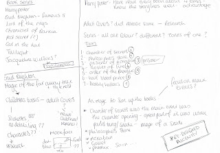
Initial ideas sheet


Page from my layout pad, trying to think of all the different book series i could think of.

Focusing more on the harry potter series and Enid blighton.

BA5. Book design series

The bookcover is an important selling device usually treated as a stand-alone item, and often
independent of the typographic design used inside the book.
This project is designed to
• increase your understanding of the publishing industry by developing an identity or
house style for a book publisher.
• generate creative ideas that can work across a range of titles and explore typographic
hierarchy on the covers.
• produce a basic format flexible enough to accommodate any title in the current list, or
any future titles, giving the series a strong and unique visual identity.
Develop an identity for a series of books. These can be fiction or non fiction. Think about
your readership: is it general or predominately of one age group? Will the book be read from
cover to cover (eg a novel) or dipped into (eg a ‘how to’ book). You can choose an existing
series, or choose from the attached list on the VLE. You are only required to design the
covers, but it is really important that you are familiar with the ‘content’ of the books. Aim for a
clear concept and a distinct identity through your use of imagery and typography.
Produce three cover designs, including the spine and back cover. Allow approximately 150
word ‘blurb’, plus bar code, price, credits, and publishers colophon. Also consider that the
book may be featured very small in a catalogue or on a website such as Amazon.

14.11.10


These are all my finished posters. There are quite a few variations here as i used different papers and textures.

Screen.


This is my A1 screen, the tape shows parts of the poster type i was masking out so that i could use different colours.
Not a great photo, but the only one I could get at the time.

12.11.10

screen printing

I screen printed my posters today, which was exciting and fun.
I was nervous, I hadn't screen printed before but was reassured by Sonia that she would help me all the way through.
I think she went beyond that!
I ask the most ridiculous questions sometimes. most of the time. I do learn from asking questions though, so its a good thing.

we used lots of different papers and experimented with colours to get the best result.
They look really great and i am proud of them.
I completely loved and enjoyed the whole process and will defiantly be going back there to do print more work.

final


So this is the final....

1.11.10

Aligned the start of the months.
Both designs.
1st one with gradience 2nd without.
Still unsure about this idea?
full colour, no gradience on the colours.
Changed the colours used and made each month have their own colour.
?

Theme

Ok, so thinking about it, the theme for my calendar is passing time/journey.... i dont know if this idea works well with them theme though.
The colour represent the changing of time as the numbers of the month get lighter as you progress through it, however i dont know if that is clear or not.
I was thinking about the idea I had and wanted, and then thought about what a guest lecturer mentioned about 'looking at it a different way' to make it more appealing to the eye.
Well thats what I have done here, and i think it looks so much better....I still have some editing to do and work on the spiral, maybe the colours. Its still a pretty simple idea that needs alot of work.

Ideas - calendar


Trying to step away from the conventional calendar idea.
I wanted to create a poster instead.

This is what i first created, I wanted the colours on the numbers to fade out as the month goes on and progresses towards the end.
colours are meant to represent each month, but i think i could play around with them a lot more.
I am really really struggling for ideas on this project and i'm finding it difficult to focus and feel like i can do this.

25.10.10

25th october - new brief (calender)

Frequently calendars are designed in a ‘standard’ linear fashion, the month in bold while the days are placed below within a rigid grid structure. In this project you are asked to consider creative approaches to calendar design. It is important that your idea still maintains functional aspects.

This project is designed to:

Encourage you to explore the use of different formats through image, materials and construction.

Appreciate typographic innovation.

Your calendar should be based on a theme, (see the separate list on the VLE). It should enable you to explore graphic imagery to its full potential. Ask questions of yourself – what can imagery be - bold effective typography, raw imagery, subtle nuances? How can the theme be carried across the year? What is a year? Twelve months, 365/6 days, an academic year, an everlasting calendar? Most importantly how should the size, format and layout of a calendar maintain function?

During this project there may be an opportunity to collaborate with students on the illustration course. There will also be an opportunity to enter your calendar into the The Wynkyn de Worde Student Award if appropriate


Calendar Design Themes / triggers to use as starting points to develop your calendar solution
As time goes by
Looking back Looking forward
A fresh day
Time
Making a date
Counting down
Deadline
Events
Celebration
Time flies
Another day
Groundhog day
Yesterday
Behind the scenes
Journey
It happened on a Monday
4
7
12
52
365

25th october - new brief ( calendar)


Today we got a new brief, calendar.
I had a few ideas... i willl upload later on.
Posters up ready for crit.

25th October-Final crit

Critique for my poster design.
I feel it went quite well, it wasn't the best and wasn't the worst, but i was happy with it which is kind of all that matters....
Anyway, few pointers were made.
I never really thought about it before, but vicki is right...you really can see work better when you have it printed to the real size it is meant to be and not just standard A4 to show for crits. It sounds to obvious thinking about it now.
But yes, i realised that i should od it more, so i will do this in future to see how my work actually looks when it comes to print.

Points made about the poster:
-could use a B size, make it longer
-Type similar to gothic type, have a little research.
-Look at dover publications
-wood cuts and wood type.
- change size of some of the text
-play about with the hierarchy
-some more kerning. You can see it so much more clearer when its printerd out into big size, and can see some terrible kerning!

Not much more to do before i send it into print, but a fair bit of modification.
Hoping to send it to print tomorrow.

24.10.10

Belly band

This comes out so tiny on here....
This is the belly band that is going to hold my cards together.
(click to enlarge image)

23.10.10

logo 4

mixing the two elements together.
I now do not know which one to use!

logo 3

more rain water.